brand / campaign / website / marketing
Transit Systems
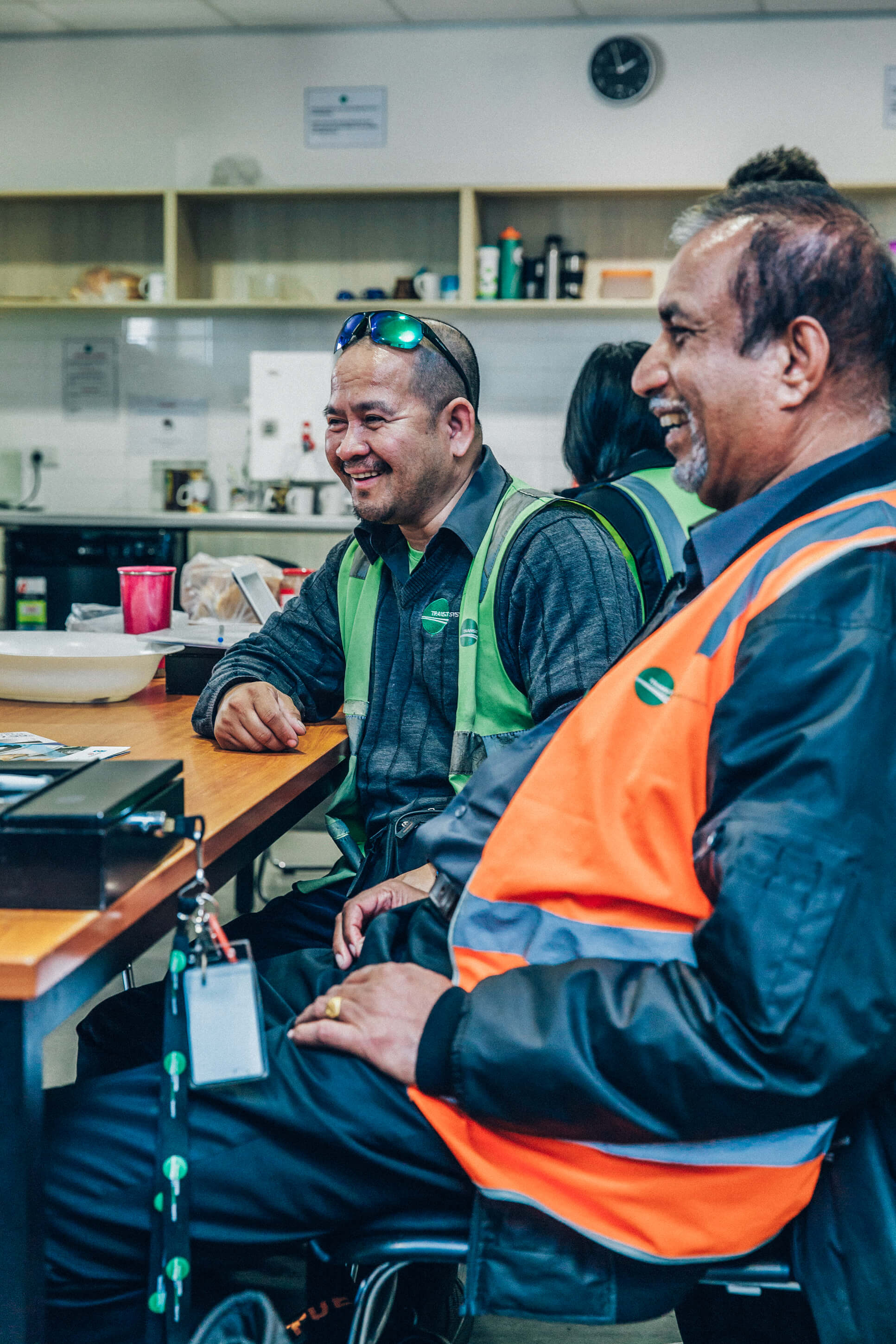
Transit Systems is a public transport operator with contracts spanning several Australian states and sister businesses in the UK and Singapore. Over the last several years Creature has helped to evolve their brand identity with work ranging from logo design to ad campaigns to website development.
Back in 2016, Transit Systems had gone through years of expansion, and with each new contract win they had introduced a new localised business name and new logo in to the mix. Their success was resulting in a disjointed parent identity, and so Creature was brought in.
Through a series of workshops and consultation with each business unit, it became clear that the solution wasn't necessarily to consolidate everything under the one Transit Systems roof. It turns out their 'localised' branding was seen as a distinct advantage when put up against the comparatively multinational brands of their competitors.
Rather than throwing the baby out with the bathwater, we worked to unify their brand identity system so as to allow them to scale with consistency yet enough flexibility to maintain that vital local touch.
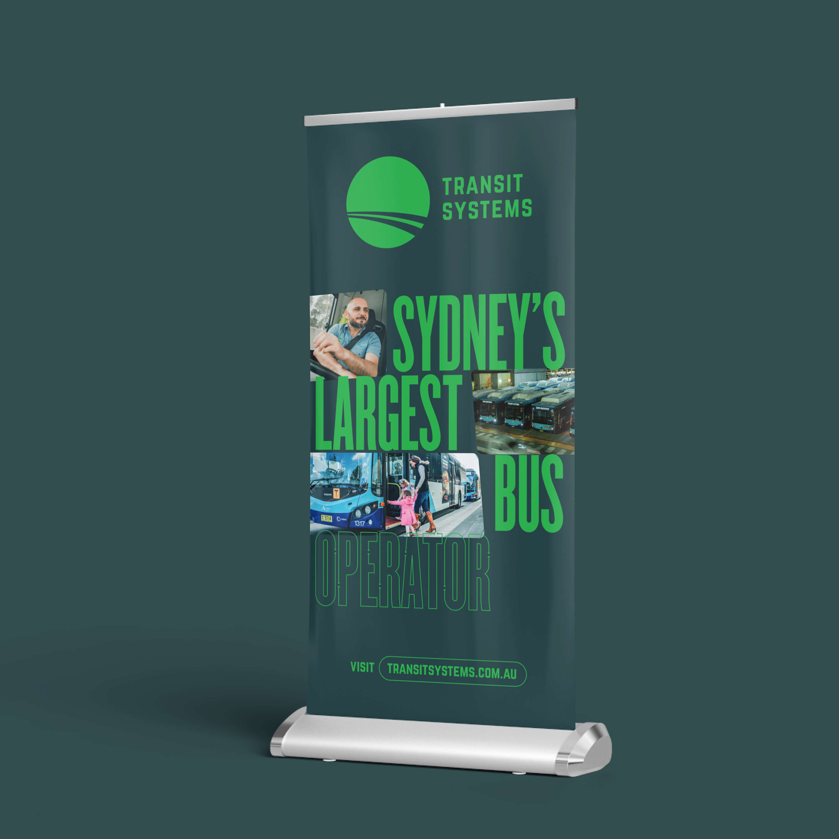
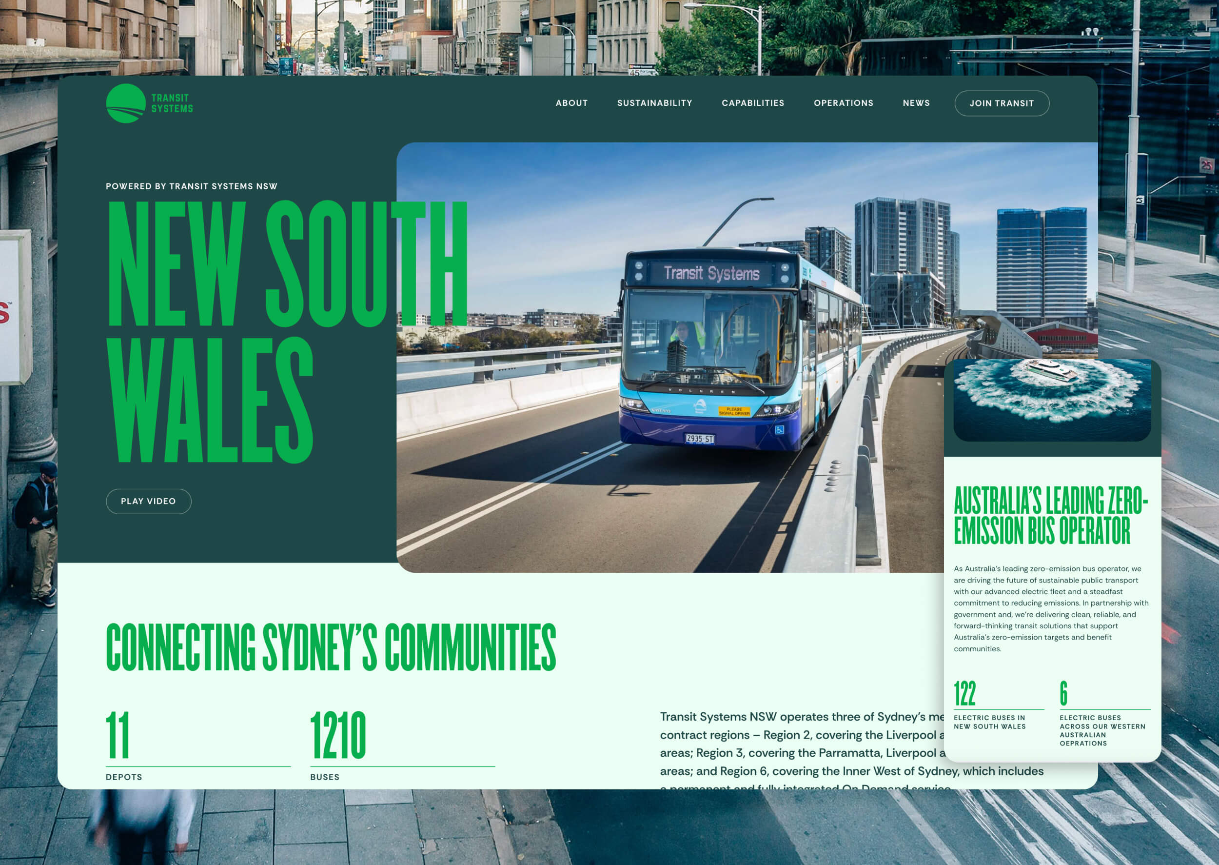
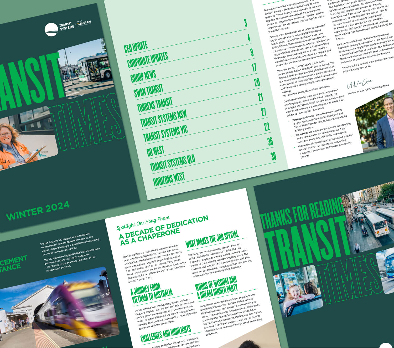
In the years since first working with them we have introduced a new logo system, rolled out key marketing collateral, designed more ads than we care to remember, and more recently delivered a new corporate website. Built on Webflow, their new website reflects their innovation and global reputation, with brand storytelling that reinforces their commitment to connecting people within each of their communities.


We liken refreshing an existing brand to steering a big ship... or in this case, a bus... and so we worked to inject new life into their existing logo, addressing some legibility issues and inconsistencies as we went. The result is a logo system that enabled local operations to have their own unique name and colourway.